About
Problem & Background
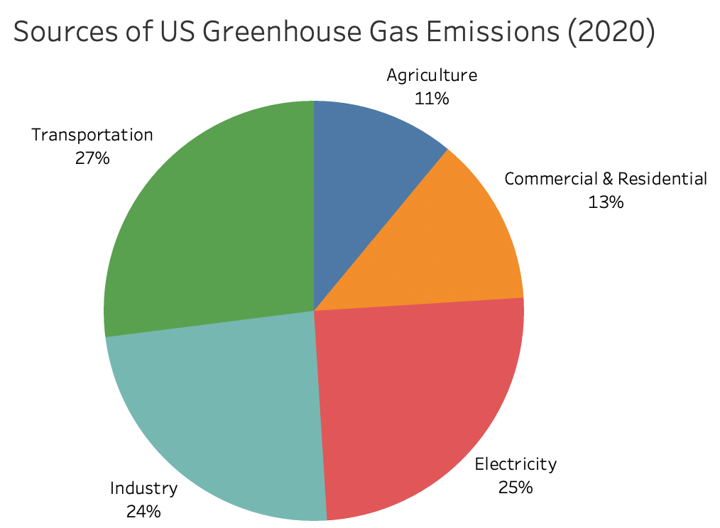
Since 2016, transportation has been the largest source of greenhouse gas emissions in the U.S. In 2020, 27% of greenhouse gas emissions in the U.S. came from transportation, and 57% of these emissions were from light-duty vehicles (US EPA).
The federal government has ambitious goals to reduce these emissions by encouraging the adoption of electric vehicles (EV) and installation of EV charging stations (Biden-Harris EV Charging Action Plan):
- 50% EV sales share in the U.S. by 2030
- Build a more convenient and equitable charging network by installing 500,000 new EV charging stations using $7.5B in federal funds
More recently announced, the Inflation Reduction Act of 2022, which is currently under federal consideration as of August 1, 2022, would eliminate the 200,000-vehicle cap per manufacturer for the federal EV tax credit, and rather than applying this $7,500 credit on EV buyers' taxes, they would be able to claim these funds upfront as a price reduction. Additionally, the Act introduces a new $4,000 incentive for used EVs (Clean Technica). Both of these provisions will encourage EV adoption by making EVs more economically accessible to middle- and low-income Americans.
Exponential growth in EVs, accelerated by federal and local incentives, will put more pressure on public EV charging station availability, especially as EV adoption becomes more economical and equitable. Concern about charging infrastructure is a commonly cited factor inhibiting EV adoption, particularly for lower income households or individuals living in multi-unit dwellings, whom may rely more heavily on public charging. (The Harris Poll, Plug In America, Autolist).
Our solution to this problem is to provide insights on charging station availability, giving EV drivers the best times to charge and giving potential EV adopters reassurance that public charging stations are accessible.
In this project, we mimicked streaming data to simulate real-time information coming from active EV charging stations. We successfully implemented long short-term memory neural network models across multiple cities, with over 27
charging stations and developed interactive tools to view the results.
With more informed drivers, public EV charging stations can be better utilized to ensure that everyone can stay charged up!
Prior Work & Literature Review
ChargedUp drew inspiration for our data architecture and models from two primary research papers: Soldan et. al (2021) and Ma et. al (2021). A high-level description of these papers and our main takeaways are included below.
Short-Term Forecast Of EV Charging Stations Occupancy Probability Using Big Data Streaming Analysis
Soldan, Bionda, Mauri, & Celaschi (2021)
Soldan et. al combined historical and streaming data to predict EV charging station demand for a single station in Italy. The focus of this paper was on the architecture for combining historical and streaming data, rather than focusing on accurate model results. The researchers implemented a streaming logistic regression model by simulating streaming data from historically collected information, which was then passed through a Kafka topic to a consumer. Once the model was updated and predictions were made, the results were stored in an influxdb database. Soldan et. al found that implementing this streaming architecture greatly improved model results and concluded that the integration of streaming data, though a more complex data pipeline, is worthwhile.
The ChargedUp team had the opportunity to speak with Francesca Soldan and ask questions about their motivations and data pipeline. We drew much of the inspiration for our streaming setup from this paper and our call with Francesca.
Read this PaperMultistep Electric Vehicle Charging Station Occupancy Prediction using Hybrid LSTM Neural Networks
Ma & Faye (2021)
In this research paper, Ma and Faye used three months of charging data from Dundee, UK, to predict charging station availability at 10-minute increments. This subhourly approach aligned well with our goal to provide granular forecasts to EV drivers.
They forecasted charging availability using hybrid LSTM Neural Networks, which combine long short-term memory neural networks with forward neural networks. Though the ChargedUp LSTM models are not quite as complex as these, we based several modeling decisions off of this paper, including number of inputs and outputs from the LSTM.
Ma and Faye conclude that the predictions from their hybrid models are most accurate for the first hour (out of 6 hours forecasted). They included traffic data which provided for the best model results due to this local environment information. Unfortunately, we were unable to implement traffic data in our project but believe this may be a good next step. The code from their project is accessible via GitHub, and the link is included below.
Read this Paper GitHub CodeData
Datasets & Exploratory Data Analysis
Data Collected & Used
We collected data from publicly available charging stations in the U.S. The City of Palo Alto in California and the City of Boulder in Colorado both have data available for download on their respective websites. We additionally have partnered with the Energy, Controls, and Applications Lab (eCAL) at UC Berkeley on their Smart Learning Pilot For Electric Vehicle Charging Stations (SlrpEV) project. eCAL’s SlrpEV project is focused around developing the next-generation of EV charging stations that intelligently manage electric power and parking through machine learning. For each of these locations, we predict charging station port availability at the 10-minute level, and additionally for SlrpEV, we predict power consumption at the 10-minute level. The data sources and links are summarized below.
- Palo Alto (Source): The City of Palo Alto, California, has made available data on EV charging sessions across 9 different charging locations
- Boulder (Source): The City of Boulder, Colorado, has made available data on EV charging sessions across 18 different charging locations
- SlrpEV (Project Website): In partnership with eCAL's SlrpEV project, we have gained additional access to data on charging sessions at the Recreational Sports Facility’s parking structure on the UC Berkeley campus
Each dataset contains information on individual charging sessions. A charging session is defined as the event where an EV driver plugs in their car at a port for a duration of time. The details of each charging session include the location of the charging station, start time of the charging session, and duration of the charging session. The SlrpEV dataset additionally incorporates power consumption in 5-minute increments, vehicle type, and charging optimization option chosen by the driver.
| City | Dates | Num Charging Sessions | Num Charging Locations | Location Type(s) | Num Chargers |
|---|---|---|---|---|---|
| Palo Alto, California | Jan 2015 to Dec 2020 | 225,699 | 9 | City-owned parking garages and libraries | 41 |
| Berkeley, California (SlrpEV) | Nov 2020 to May 2022 | 1,660 | 1 | Campus parking garage | 8 |
| Boulder, Colorado | Jan 2018 to Apr 2022 | 35,337 | 18 | City-owned parking garages, recreation centers, and parks | 44 |
Data Limitations
We recognize that our data is limited in scope, both in time and space.
- Some charging sessions are not as current: Palo Alto only has data through 2020
- Publicly accessible data in this field is limited to only a few locations and is not a representative sample of all charging stations in the U.S.
Palo Alto
5% of the time, Palo Alto charging station locations are fully occupied.
In 2014 Palo Alto passed a local law requiring all new apartment complexes, hotels, and commercial buildings to include EV charging,
or include the electrical requirements to install charging capabilities later (Palo Alto Online).
This has allowed for an increase in charging capacity for EV owners, greatly benefitting the 1 in 6 drivers in Palo Alto whom own an electric vehicle
(City of Palo Alto).
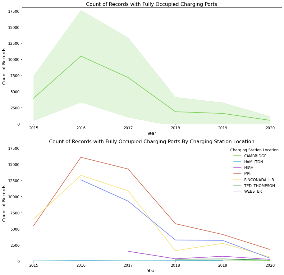
From our dataset of charging sessions in Palo Alto, we saw about 5% of the time there were charging station locations with fully occupied ports. Of the charging station locations, MPL (Mitchell Park Library) had the highest full occupancy rate at 15%,
followed by the Rinconada Library with 11%. The number of fully occupied charging stations decreased starting in 2016. Looking at the fully occupied charging station locations in the second chart,
new charging locations and charging ports were added in 2017, 2018 and even more in 2020. The data we have from Palo Alto does not include charging station ports that were added in 2020. 2020 was an odd year
as well due to the COVID-19 pandemic which also caused a lower need to travel, and thus less utilization of EV charging ports.
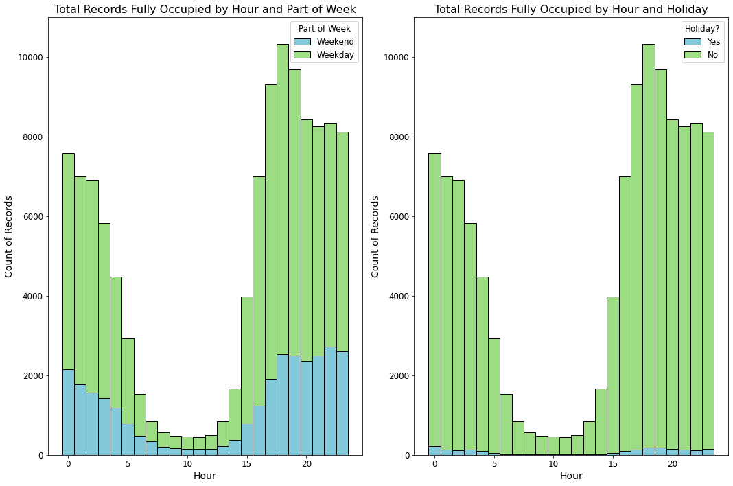
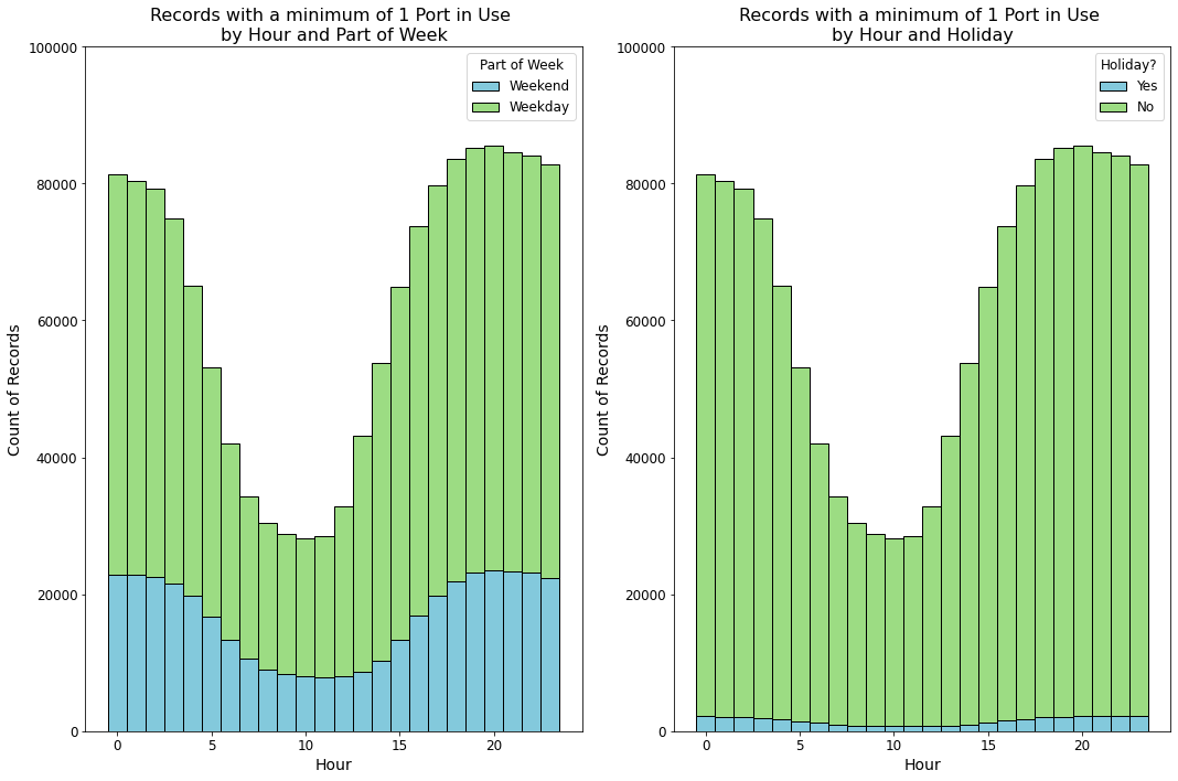
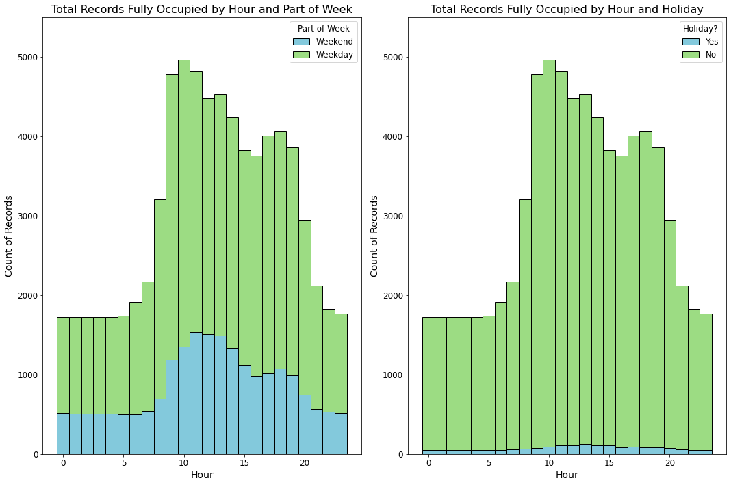
Full occupancy of the charging ports across all Palo Alto locations occurred most frequently during the hours of 3 PM to about 5 AM. At about 6 PM there were over 10,000 records of full occupancy.
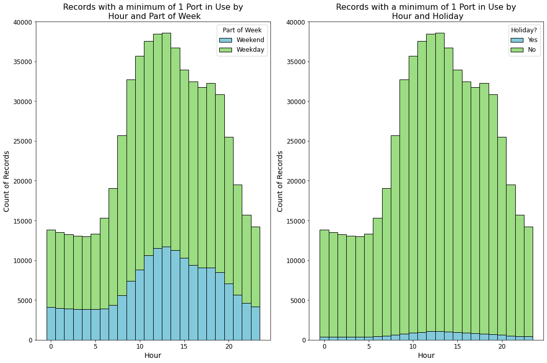
There was not a large difference in full occupancy by hour between holiday days vs non-holiday days nor between weekdays or weekends. The utilization of charging stations by hour is consistent for
fully occupied periods and periods where one or more charging port was in use.
- The charging station locations with the highest rate of fully occupied ports are the Mitchell Park Library (MPL) and Rinconada Library.
- Charging ports are used the most during late afternoons and overnight, from 3 PM to 4 AM.
- Charging during the weekend and holidays, follows a similar usage pattern as weekdays and non-holiday days.
4.83% of the Palo Alto records are fully occupied. By charging station location, this varies more greatly.
| Charging Station Location | % Fully Occupied | % Fully Occupied & Weekend | % Fully Occupied & Holiday |
|---|---|---|---|
| Mitchel Park Library (MPL) | 15.0% | 4.9% | 0.3% |
| Rinconada Library | 11.3% | 3.7% | 0.3% |
| Webster St. Parking Garage | 10.0% | 1.1% | 0.1% |
| High St. Parking Garage | 0.9% | 0.04% | 0.0% |
| Ted Thompson Parking Garage | 0.3% | 0.0% | 0.0% |
| Cambridge Parking Garage | 0.1% | 0.0% | 0.0% |
| Hamilton Ave., City Hall Parking Garage | 0.04% | 0.01% | 0.0% |
Berkeley
Charging Ports are Utilized the Least During School Breaks, Holidays and Weekends
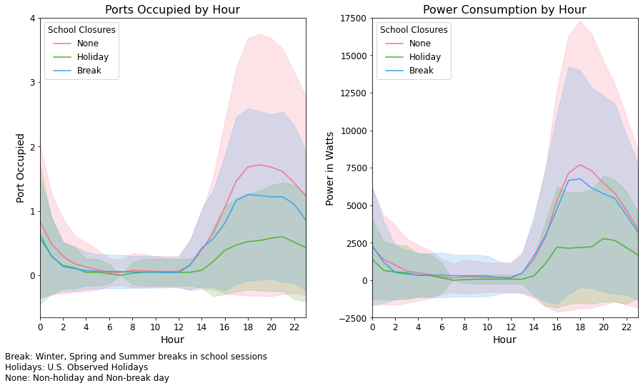
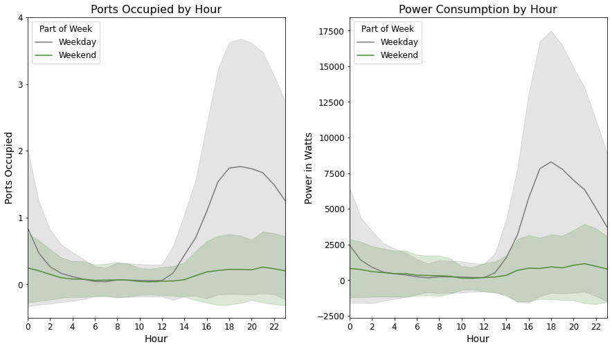
At the Berkeley charging station location, the charging ports are used the most during non-school-closure days. During holidays, the average ports in use is less than 1. During school breaks, such as Summer, Spring and Winter Breaks, the charging ports are used more frequently than during holidays but, less than non-school-closure days. We observe that ports are occupied the most during weekdays, compared to the weekends (Saturdays and Sundays). The charging stations are used the most during the evening times around 7 PM. Between 3 AM to noon, the port occupancy on average is the same regardless if there is a school closure or not, and regardless of weekend status. The power consumption, measured in watts, follows a similar trend as the average number of ports occupied. Power is not consumed on average between 3am and noon but is consumed the most around 6 or 7 PM.
- During holidays, charging ports are not used frequently.
- During academic breaks, charging ports are used more than holidays but less than usual.
- Utilization is the highest during non-holiday and non-academic break time periods.
- Charging ports on average are occupied more frequently during the weekdays, Monday through Friday, compared to the weekends.
- Charging ports are used the least between 3 AM and noon. Ports are used the most around 6 or 7 PM
The band around each line in the charts corresponds to the standard deviation.
Boulder
10% of the time, Boulder charging station locations are fully occupied.
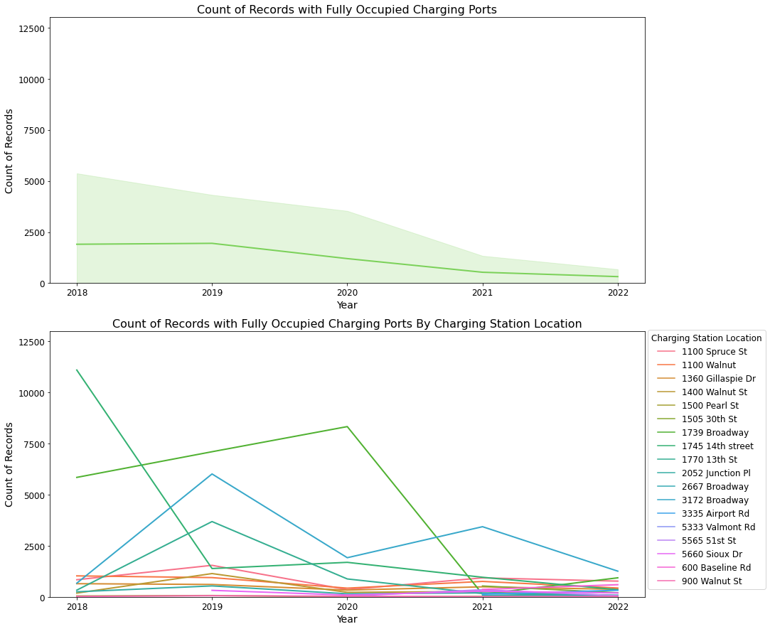
In Boulder, the charging stations were fully occupied 10% of the time. The top 3 charging station locations with the highest number of times with full occupancy were
1739 Broadway, 1745 14th Street, and 3172 Broadway with 10%, 7% and 6% respectively.
The number of records with full occupancy has been steady to declining between 2018 and May 2022. Additional charging station locations were added in 2019 and in 2021 which may have caused
the fully occupied rate to decrease.
In contrast to the stations in Palo Alto and Berkeley, ports used in Boulder tend to fall in the middle of the day more frequently than in the evening or overnight.
Full occupancy at stations occurred during the hours of 9 am and 7 pm. The weekend and holidays also follow a similar pattern to charging port usage, as
weekdays and non-holiday days.
- The charging stations with the highest rate of fully occupied ports are located at 1739 Broadway, 1745 14th Street and 3172 Broadway.
- The number of times charging stations are fully occupied has been steady to decreasing between 2018 to 2022.
- Charging ports are used the most between 9 AM and 7 PM.
- Hourly usage during the weekend and holidays follows a similar pattern as weekdays and non-holiday days.
9.81% of Boulder records are fully occupied. The percentage of timestamps thats are fully occupied varies by charging station location.
| Station | % Fully Occupied | % Fully Occupied & Weekend | % Fully Occupied & Holiday |
|---|---|---|---|
| 1739 Broadway | 9.81% | 3.16% | 0.32% |
| 1745 14th street | 6.8% | 1.94% | 0.19% |
| 3172 Broadway | 5.84% | 1.24% | 0.09% |
| 1770 13th St | 2.24% | 0.66% | 0.03% |
| 1100 Spruce St | 1.95% | 0.64% | 0.05% |
| 1100 Walnut | 1.58% | 0.42% | 0.02% |
| 1360 Gillaspie Dr | 1.07% | 0.23% | 0.02% |
| 1400 Walnut St | 0.82% | 0.06% | 0.01% |
| 2052 Junction Pl | 0.53% | 0.09% | 0.02% |
| 600 Baseline Rd | 0.42% | 0.25% | 0.01% |
| 5660 Sioux Dr | 0.39% | 0.09% | 0.0% |
| 1505 30th St | 0.32% | 0.07% | 0.01% |
| 3335 Airport Rd | 0.2% | 0.08% | 0.01% |
| 5565 51st St | 0.19% | 0.11% | 0.0% |
| 2667 Broadway | 0.06% | 0.01% | 0.0% |
| 900 Walnut St | 0.05% | 0.02% | 0.0% |
| 1500 Pearl St | 0.04% | 0.02% | 0.0% |
| 5333 Valmont Rd | 0.0% | 0.0% | 0.0% |
Data Cleaning & Processing
During data cleaning we identified charging sessions that need to be removed or corrected.
EV charging sessions with total durations over 1440 minutes, more than 24 hours, were considered outliers. Through confirmation with the data sources,
we determined these are likely abnormal and could be removed. In Palo Alto, most station locations have a 3-hour parking limit, and there was an overstay fee if the car remained plugged in after
charging was completed. The Palo Alto data set included 22 charging sessions greater than 1 day, and Boulder data set included 478. Berkeley did not have charging sessions greater than one day.
For the Palo Alto dataset, some of the charging sessions had inconsistent timezones. Some included a start and/or end time in the UTC timezone, while others were in local time, PDT or PST. These were converted
all to local time. Furthermore, for 45 records, total durations at the charging stations were less than the total charging time, so we swapped these values.
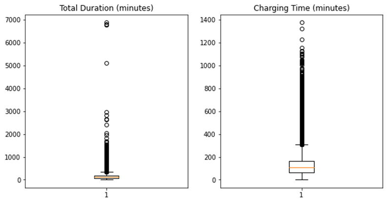
The total duration is the length of time a car is plugged in at the charging port, while the charging time is the length of time a car is actively being charged. Thus the total duration must be greater
than or equal to the charging time.
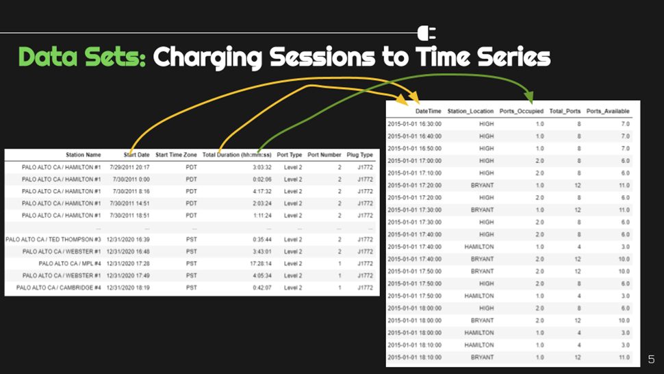
After cleanup, we then converted the charging sessions into a time series dataset with data at 10-minute intervals. There were some charging sessions with a start and end time greater than the total
duration. This was likely an error, so we decided to use start time and total duration to calculate time series intervals.
Since some stations were installed in the middle or later than the starting period covered by the datasets, these stations will not appear until later in the time series.
To transform port occupancy into a time series, we identified if there was an active charging session for a given time period and marked our "ports occupied" value with a 1. We then grouped charging ports at the same charging station location and
aggregated by summing the ports occupied. In order to prevent duplicates when a new charging session started within the same 10 minute interval, we dropped duplicate records by datetime, and station location
prior to aggregating the ports occupied. Total ports available at each charging station location were gathered from the data sources. Then, the number of ports available was a simple arithmetic calculation.
Data Pipeline
End-to-End Data Pipeline
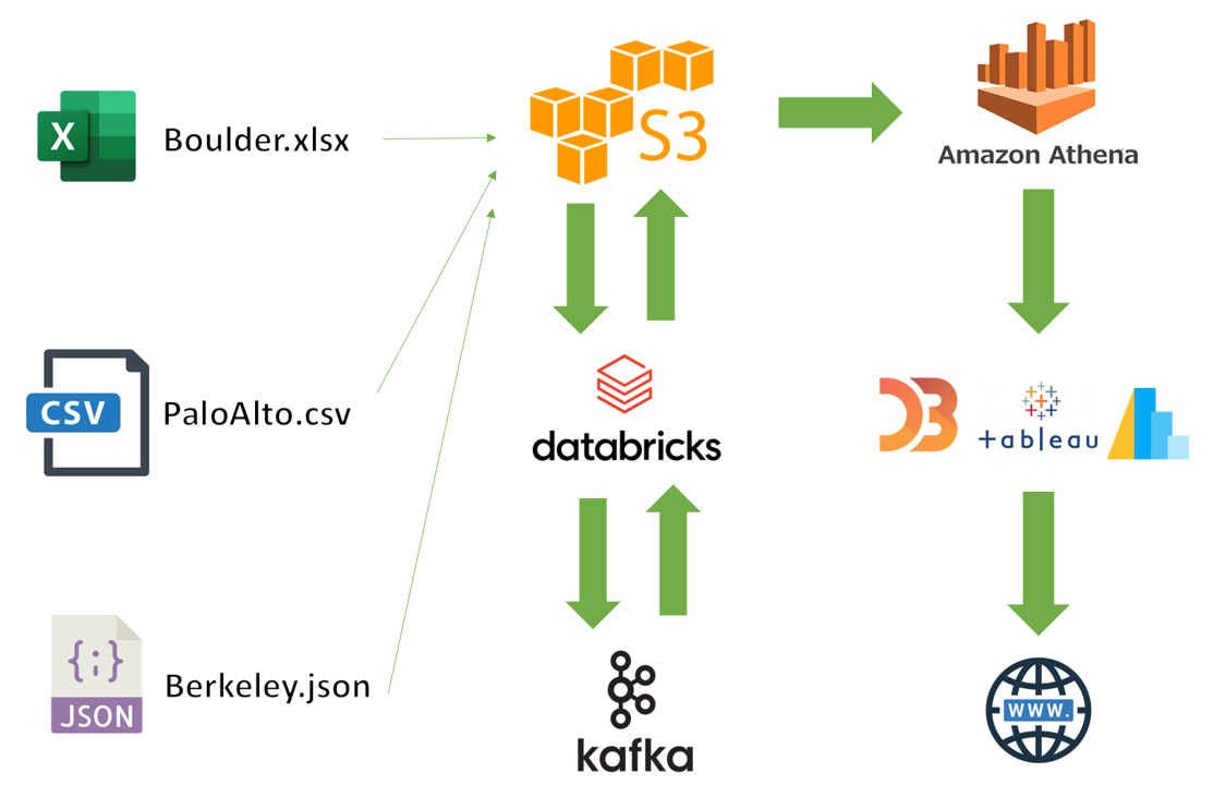
Our pipeline takes data from our three target areas, simulates streaming data from the historical datasets, and generates pseudo-realtime predictions. Ultimately, all the predictions for our tracked stations are displayed interactively (here!) on our website.
Here are the steps our Data Pipeline follows:
- Load raw data from our various sources. In our initial implementation, this includes Berkeley, Palo Alto, and Boulder. These are stored in an AWS S3 bucket.
- Clean and standardize the different datasets such that the data for the three locations are all in the same format. This includes transforming the charging session data into a time series at 10-minute intervals of station availability, as described in the "Data Cleaning & Processing" section above.
- Simulate streaming using the time series data generated previously. As these datapoints (at 10-minute increments) begin to flow in, the history of datapoints begins to accumulate. Every hour worth of datapoints for a given station, a new prediction profile for the next 6 hours is generated. Similarly, an entirely new model is trained on the past 90 days of data every 15th of the month.
- Save predictions back to our S3 environment. In this fashion, the predictions are made available for subsequent presentation and visualization steps.
- Visualize & present results by loading the predictions from S3 into different visualization tools using AWS Athena. Our visualization tools of choice include Tableau, Python libraries such as Folium and Plotly, and others. Finally, we embed these results into our website (the one you are on now!) for consumption by our end-users. Notably, we have an interactive map where users can geographically locate their desired station and see a popup graph of station availability forecasted 6 hours into the future.
We utilized Kafka since we built this project with future deployment in mind. In particular, the ability to scale this project to many sensors feeding realtime data to our system was our ultimate goal. That is, we designed our data pipeline such that real-world IoT sensors placed on charging stations could feed directly into our Kafka setup. After that point, the streaming messages (sent every 10 minutes) would be processed in much the same way as our simulated streaming data.
To simulate three months of 10-minute streaming data across our 27 stations took roughly 7 days of processing time. While this may seem like a long time to process our data, in practice once we have an initial fitted model for a station, we would only process one datapoint every 10 minutes with the current station availability. In reality, as long as our processing time (saving the new datapoint, making new predictions, or fitting a new model) is less than 10 minutes for each given station, then this process will function without error.
Modeling
Forecasting Models
Time Series Models Considered
We considered several different time series models of varying complexity with the goal to increase the accuracy of our predictions with each iteration. We developed one model for each charging station location in our datasets. As mentioned in the Data Pipeline Section, since we included three months of training data in our models (and since some stations came online/went offline at different times), we ended up making 27 models (18 for Boulder, 8 for Palo Alto, and 1 for SlrpEV in Berkeley). We recognize that this approach may not be scalable as more stations are integrated into the data pipeline. At that point, we would further consider the spatial relationships among chargers to consolidate groups of locations into just a few models.
Within our current limitations, here is a list of the time series models we considered:
- Benchmark Model 1: Predict the Average Availability (with and without streaming data)
- Benchmark Model 2: Predict the Average Availability by Day of Week and Hour
- Benchmark Model 3: Predict the Average Availability by the last 12 time steps in the training dataset (with and without streaming data)
- Autoregressive Integrated Moving Average (ARIMA) Models
- Prophet from Facebook
- Long Short-Term Memory Neural Networks
Feature Engineering
The primary feature in our models was the availability of charging ports at a particular charging station. For SlrpEV, we additionally modeled power consumption in watts at the location. As previously mentioned, this data is available at the 10-minute level. In our EDA process, we discovered there are several time-based relationships that exist in our data, which could be beneficial to have as features in our time series models, such as an indicator variable for weekends. Below is a list of the different features we engineered and integrated into our time series models. We developed models both with and without these additional features to see if they created substantial improvements.
- For all datasets: Time-based feature engineering (hour of day, day of week, month, weekend binary variable). Hour of day, month, and day of week were transformed using sine and cosine functions to account for the cyclical nature of these features.
- For SlrpEV: Inclusion of UC Berkeley's Academic Calendar to identify school breaks and academic holidays.
Batch Model Framework
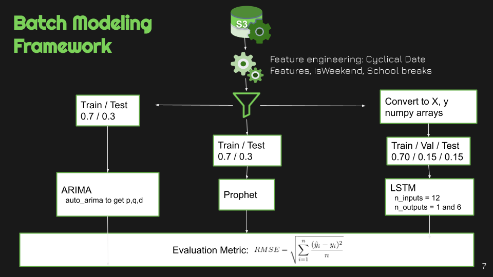
For the batch models, the modeling framework started with first reading in our data from our S3 bucket. Next, we added the features discussed in the Models Overview section.
Then, prior to modeling, we filtered the datasets for each city for 129 days. For Palo Alto, we chose to use 129 days starting at the beginning of 2019 because the most recent data, from 2020,
likely had impact from COVID-19. 129 days was selected so that when we performed a train-test split of our data, we had 3 months to use as training data.
The ARIMA and Prophet models utilized a train and test set with a 70%/30% split. The auto_arima function was utilized to gather our parameters, p, q, and d for our ARIMA models, which are described below.
p - order of auto-regressive (AR) in ARIMA. It is the dependent relationship between current data and its past values.
It is also known as the number of auto-regression terms,
or the number of lag data points.
q - order of moving average (MA) in ARIMA. It is the number of forecast errors in the model, or the size of the moving average window.
d - order of differencing (I) in ARIMA. This is the degree of differencing in the model.
D is the number of times lagged indicators have been subtracted to make the data stationary. This is set to 0 in our models.
For the LSTM models we converted our data set to 2-arrays, X and y. X was a 3-dimensional array: the first dimension was the size of datasets, the second is the number of inputs or steps in, and
the third is the number of features. y was a 2-dimensional array: the first dimension was the size of dataset, and the second dimension was the number of steps predicted out.
LSTM requires a validation set to be passed into the model function, so we did a 3-way split, 70% for train, 15% for validation and 15% for test.
We chose the previous 12-lags as the inputs (a strategy also done by Ma et. al (2021)),
and predicted 1 and 6 steps out, 10 minutes and then 6 ten-minute intervals, or 1 hour.
The evaluation metric we chose was the Root Mean Squared Error (RMSE).
RMSE is easy to interpret as it is in the units of the dependent variable, and it helps to estimate how far off our predictions are from the actual values.
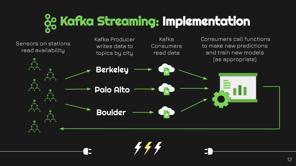
Streaming Model Framework
For the streaming models, we seeded an initial LSTM (Long Short Term Memory) model for each station with the first 90 days of data available for each. Then, we setup a Kafka topic for each city that we had data for. Note that
although we only had 3 topics (one for each of Berkeley, Palo Alto, and Boulder), we still trained 27 individual models across the stations located within each city.
We then create a single Kafka producer, which sent all the data for the stations to the corresponding topic. Subsequently, this data is consumed by the coresponding Kafka consumer by city.
Collecting streaming data - newly streamed data to our system gets appended to a history which we use to produce our station availability prediction results.
Re-predicting - every hour, or every 6 new streaming values on a 10-minute basis, we recalculate the predicted availability for each station for the next 6 hours. This predictions are generated by feeding
the new values that have been streamed in by station and location into our LSTM models by station and collecting the results. These predictions are then saved into an S3 bucket for later use and delivery.
Re-training - every 15th of the month, we re-train our LSTM models for each station using the newly collected data that has been streamed though. These newly refreshed models are then used for our predictions
until the 15th of the following month.
Results
Results from Forecasting Models
This tab provides a summary overview of the forecast modeling results for the batch process models and the streaming model results.
Model Results for All Locations: No Streaming Data
The following models were trained using 3-months of training data. For the LSTM model,
nearly three weeks were used as a validation set. Finally, nearly three weeks were saved
as testing data. The LSTM models with 1-step predicted had the best overall RMSE among all of the models.
With features added, the RMSE slighly improved for the ARIMA models.
However, adding features, increased the RMSE for the LSTM and Prophet models. Even with a degraded RMSE,
the LSTM model with features was better than the improved ARIMA model. Among the benchmark models, the
average by day of week and hour outperformed most of the models, with the exception of the LSTM models.
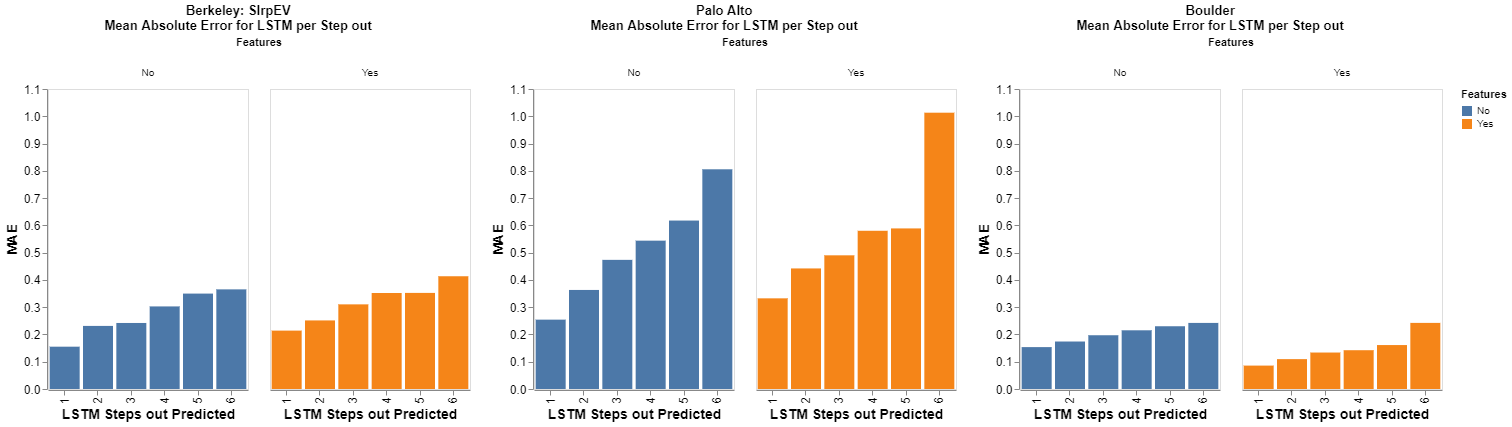
For the LSTM models, 6-steps out did worse than 1-step because each 10 minute step past the
first gets less accurate the further out we predicted. This can be viewed in the image below the table below.
In Boulder, the station locations have similar utilization patterns, which results in the models for each location
performing relatively similar to each other. The Palo Alto stations have heavier utilization, and more ports
per station location, which results a greater difference in performance among each model and also higher RMSEs compared to Boulder or Berkeley.
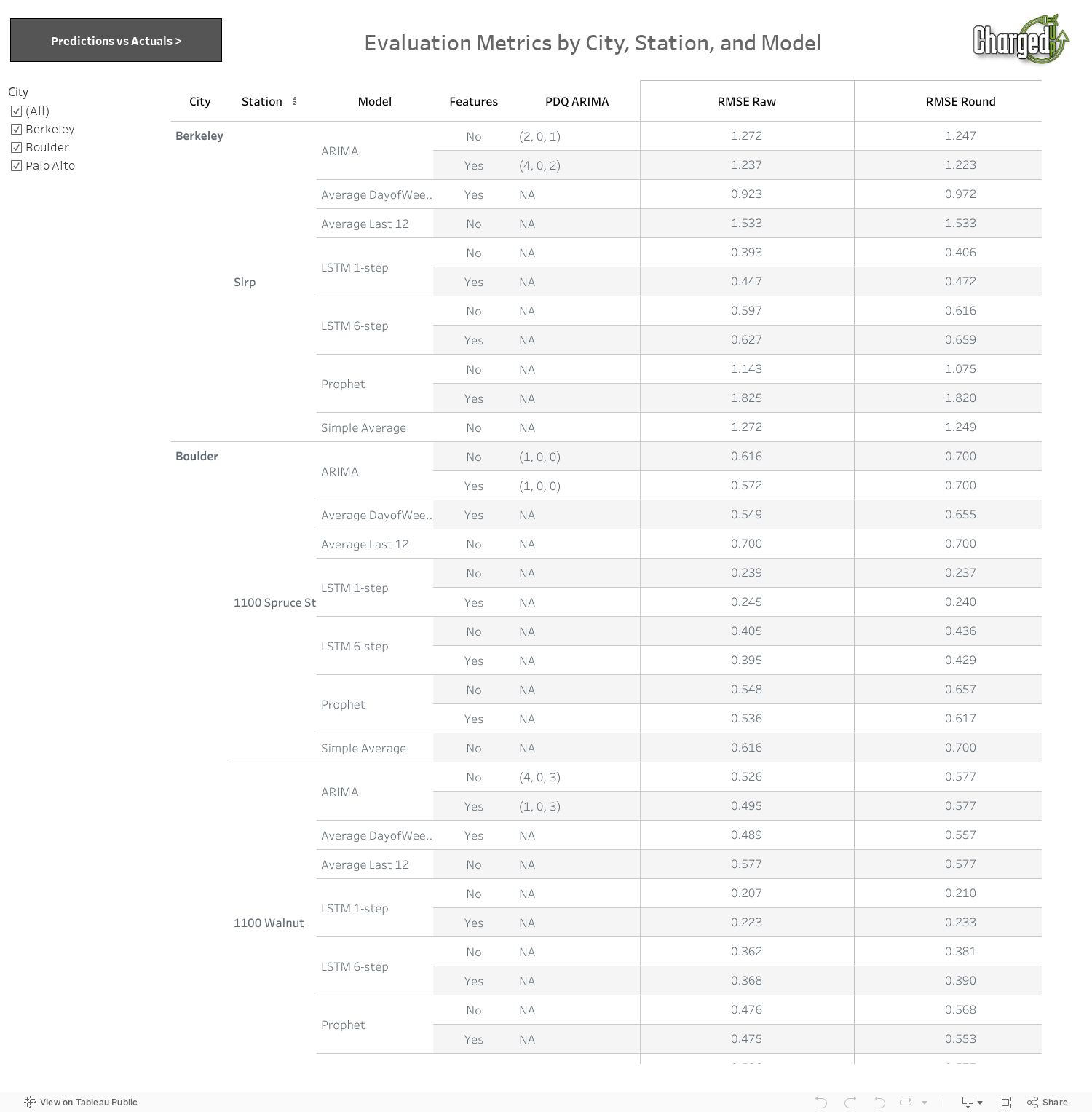
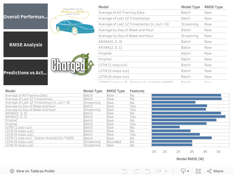
| Model Type | Parameters | Extra Features | Palo Alto: Mean RMSE | Berkeley (SlrpEV): RMSE on Test Set | Boulder: Mean RMSE |
|---|---|---|---|---|---|
| Predict Average | None | No | 1.6972 | 1.2489 | 0.5144 |
| Predict Average by Day of Week and Hour | None | Yes | 1.2119 | 0.9715 | 0.5010 |
| Predict Average of Last 12 Timesteps | None | No | 2.1400 | 1.5332 | 0.5888 |
| ARIMA | (p, d, q) varied by station |
No | 1.6923 | 1.2473 | 0.5182 |
| ARIMA | (p, d, q) varied by station |
Yes | 1.5919 | 1.2227 | 0.5079 |
| Prophet | None | No | 1.2598 | 1.0746 | 0.5116 |
| Prophet | None | Yes | 1.3417 | 1.8120 | 0.5139 |
| LSTM | Window Size = 12, Predict out 1 timestep | No | 0.5993 | 0.4060 | 0.1884 |
| LSTM | Window Size = 12, Predict out 1 timestep | Yes | 0.4995 | 0.4718 | 0.3060 |
| LSTM | Window Size = 12, Predict out 6 timesteps | No | 0.8876 | 0.6156 | 0.4070 |
| LSTM | Window Size = 12, Predict out 6 timesteps | Yes | 0.9604 | 0.6587 | 0.3759 |
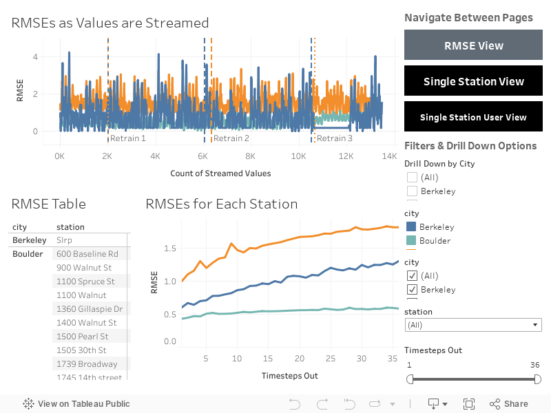
Model Results for All Locations: With Streaming Data
The following models were trained using 3 months of training data.
Predictions were made using streaming data every hour, and these predictions are for 6 hours out at a time at the 10-minute level (total of 36 timesteps).
Models were retrained on the 15th day of each month. The results below are the average RMSEs for the first 6 of the 36-timestep predictions, averaged by station, averaged by city.
For comparison purposes we only looked at the first hour of predictions since Ma et. al (2021) found these to be most accurate.
Three months of data were streamed for predictions.
The models have mixed results: the lowest RMSEs for Palo Alto correspond to the first model type, the lowest RMSEs for Berkeley correspond to the LSTM, and the lowest RMSEs for Boulder correspond to the second model type.
| Model Type | Parameters | Extra Features | Palo Alto: Mean RMSE | Berkeley (SlrpEV): RMSE | Boulder: Mean RMSE |
|---|---|---|---|---|---|
| Predict Average by Day of Week and Hour | None | Yes (Averages by Day of Week and Hour) | 1.1554 | 0.9338 | 0.5030 |
| Predict Average of Last 12 Timesteps | None | No | 1.1714 | 0.7393 | 0.3899 |
| LSTM | Window Size = 12, Predict out 6 Timesteps | No | 1.1812 | 0.6873 | 0.4764 |
Batch Modeling Results
Below is a Tableau dashboard with the batch modeling results (no streaming) by charging station location. Overall the LSTM models performed the best. The first page provides the RMSE per charging station location by each model. The second page allows you to compare the predicted ports against actual ports available.
Results Analysis for All Stations
Below is a Tableau dashboard with the results for the streaming models. You can view the RMSE for all stations on the RMSE View page. On the Single Station View page, you can compare the predictions with the actuals and see how these change as more data is streamed into the model. The Single Station User View is what an EV driver might see as a forecast of charging station availability over the next 6 hours. This page only includes the predicted availability since in a practical setting, we would not know the actual availability in the future.
SlrpEV Results
As part of our partnership with the Energy, Controls, & Applications Lab at UC Berkeley, we performed an additional analysis to predict power consumption at the SlrpEV charging stations on UC Berkeley's campus. The power for these stations is measured in Watts, and for the LSTM models, we rounded the predictions as necessary so they made sense (ex. no negative powers and no powers greater than 80 kW, or 10 kW per station).
Map
Interactive Map of Charging Station Predictions
Select a charging station to view the predicted availability of charging ports!
Learn More
Frequently Asked Questions: EV Charging
-
What are the different types of electric vehicles?
Battery Electric Vehicle (BEV), Plug-in Hybrid Electric Vehicle (PHEV), Hybrid Electric Vehicle (HEV), and Hydrogen Fuel Cell Vehicles are all electric vehicles. Only BEVs and PHEVs are chargeable at EV charging stations. BEVs are fully electric and do not have a gasoline fuel tank, whereas PHEVs have both a rechargeable battery and a gas tank. PHEVs tend to have smaller battery capacities than BEVs. HEVs do not have a battery pack that can be charged at an EV charging station, and hydrogen fuel cell vehicles are refueled with hydrogen, rather than electricity.
-
What are the different types of EV charging stations?
There are three main types of EV charging stations: Level 1, Level 2, and DC Fast Charging (DCFC). Level 1 is the slowest charger, typically used for household charging. Level 2 is faster than Level 1. If used at home, Level 2 chargers require rewiring, otherwise EV drivers must use public charging stations for access to Level 2 chargers. DCFCs are fast chargers, only for BEVs. They can charge an EV in 30 minutes and are ideal for road trips or long drives.
-
What is a charging network?
A charging network is an infrastructure system of charging stations. There are many providers of charging networks, including ChargePoint, Tesla, EVgo, EV Connect, Blink Charging, and Electrify America.
-
What is the difference between a kW and a kWh?
A kW (kilowatt) is a rate of electricity usage, while a kWh (kilowatt-hour) reflects the total amount of electricity used. In EVs, kWh can also refer to the energy capacity of a battery.
-
What is the difference between a charging station, a charging location, and a charging port?
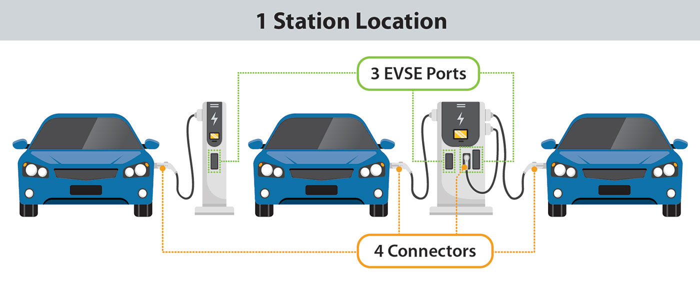
In this project, we avoid using "charging station" as a single term since there is ambiguity around the definition. Instead, we stick to "charging station location" and "charging port" to distinguish between different features. According to the Alternative Fuels Data Center (AFDC), a "station location" is a site with one or more electric vehicle supply equipment (EVSE) ports at the same address. This could include a parking garage or mall parking lot. An EVSE port provides power to charge only one vehicle at a time. You can read more about Charging Infrastructure Terminology through the AFDC.
Team
Our Hardworking Team

Yolanda Cardenas
Chief Driving Officer
Jenny Conde
Chief Electric Officer