Overview
Description
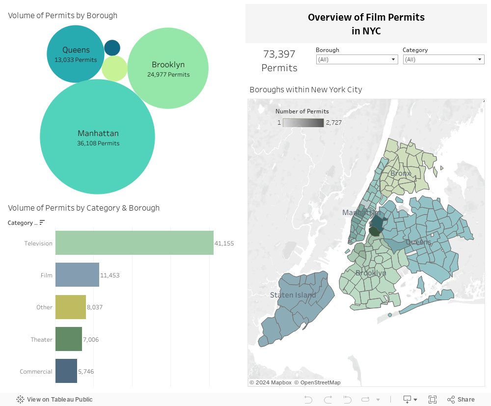
The three visualizations in this dashboard give a high level overview of the data in the New York City Film Permit data set. The intended audience for this dashboard and the following ones is media content creators such as film and television producers as well as traffic and public safety officials in New York City. The bubble chart gives a breakdown of all permits through time by the different boroughs of New York. Beneath that chart, there is a bar chart that shows the breakdown of permits by the different media types. Next, the user can go slightly more in depth with the choropleth on the right side of the dashboard to see which zipcodes of the city have the highest and lowest concentrations of permits. Clicking into this visualization will also allow the user to filter by specific zip codes in New York. The color coding of the choropleth matches with the bubble chart. Additionally, users can filter by clicking into the charts or using the filters above the choropleth. Filtering should affect all the visualizations in the dashboard. Finally, there is a sum total of permits next to the filter, so users can quickly access the number of permits that fall into their filter criteria.
Seasonal Analysis
Description
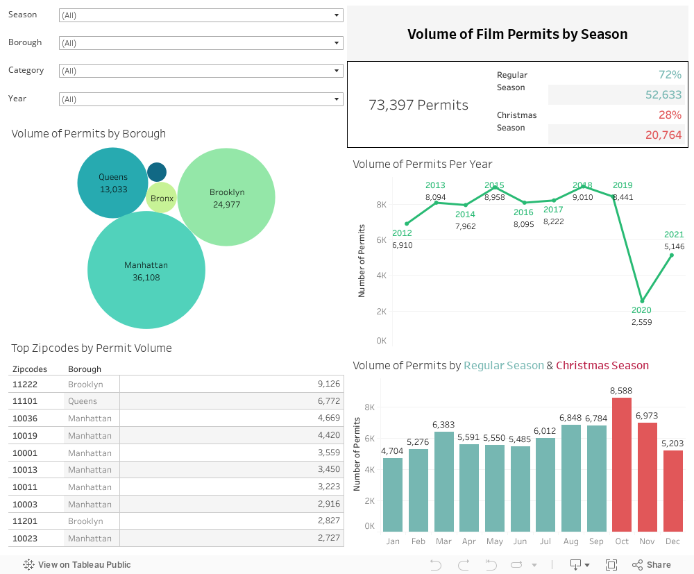
This dashboard allows the user to conduct a deeper analysis of the dates which permits began. We have identified the Holiday season as being a potentially busier time of the year for media permits, so these months (October, November and December are highlighted in the visualizations on the right. The bubble chart on the top left ties this dashboard to the overview dashboard above; however, this section contains a details table of zip code information rather than the choropleth map. Additionally, the dashboard allows for the user to filter the visualizations through time. The line graph shows the change in permit volume from 2012 through 2021. Additionally, the bar chart below shows the breakdown of permits by month to show seasonality on a more granular level. Finally, there are high level statistics available for the user to quickly access totals based on the filters selected. Again, this dashboard is filterable through both the filters in the top left section and by clicking into the different charts.
Average Permit Duration Analysis
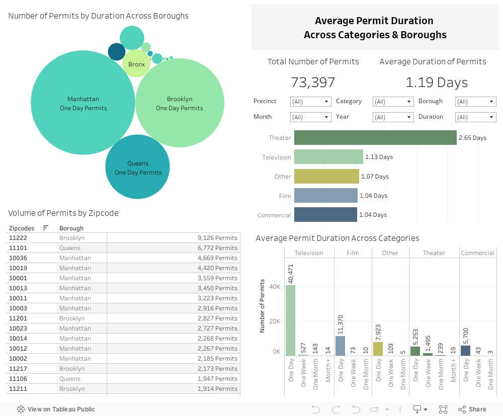
Description
The final dashboard allows the user to explore another side of the data: the duration of permits based on the start and end times included in the data. Again, there is a bubble chart and zip code details table to tie this dashboard to the two above. The bubble chart is broken down both by borough and a calculated field called “duration bucket.” This field categorizes the permits into the following buckets based on the start and end dates listed in the data: “One Day,” “One Week,” “One Month,” “Month+”. Additionally, this dashboard contains a bar chart that allows the user to easily compare the average duration of the different permit categories in the top right section. The most granular chart is at the bottom right which breaks the different duration buckets down by category for cross comparison. This dashboard contains main of the filters above, but also includes a “precinct” filter to specifically allow public safety officials to access data on how the permits and durations break down for specific police precincts around the city. Once again, we employed the same method of including high level statistics so the user can easily find the total amount and average duration of the filtered data.