Precipitation and Drought Severity

Precipitation levels and droughts are matters of grave importance as climate change continues. Being able to accurately measure, track, and predict how precipitation levels and drought conditions are changing over time will enable us to protect valuable industries, reduce social instability, and optimize human habitability.

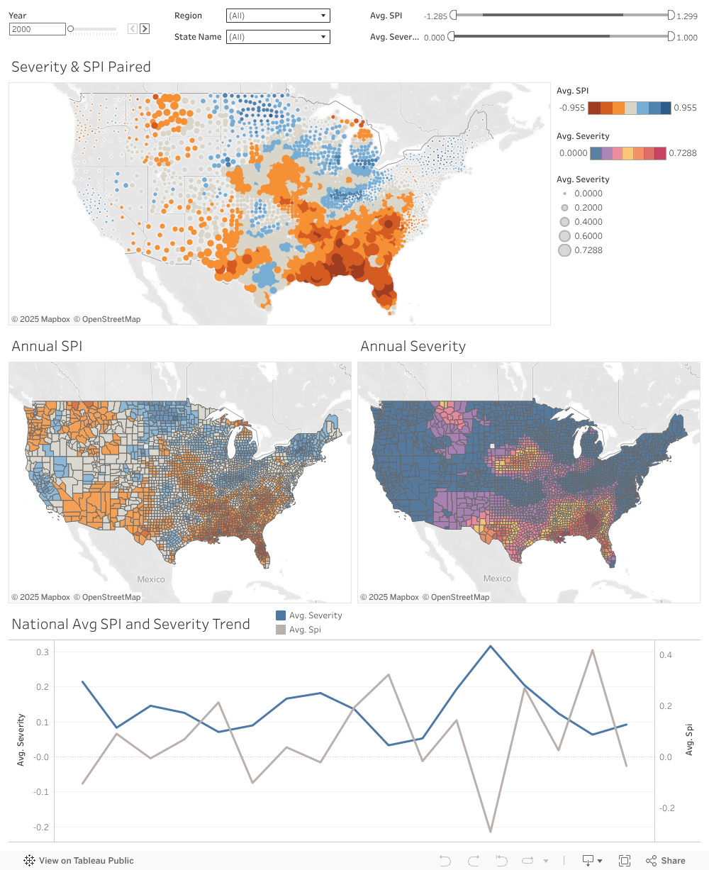
Use the interactive visualization below to see trends in precipitation level and drought condition in the US between the years 2000 and 2016.


View the full-size version of this visualization at the link below:

Features

  • Easily and interactively view data and trends relating to SPI and Drought Severity across the US from 2000 to 2016.
  • Unified map of SPI and Drought Severity data, along with individual SPI and Drought Severity maps.
  • Line graph of SPI and Drought Severity data nationwide or within selection region.
  • Filter by Year, Region, State, SPI, or Drought Severity values.
  • Use the selection tool to dynamically select and view individual counties.

Terminology

  • SPI (Standardized Precipitation Index): An index of the amount of precipitation in a region compared to historical average.
  • Drought Severity: A calculated scale of how intense a drought condition is in a region. Note that a value of zero indicates no drought, and a value of one indicates that 100% of region is in the most severe drought condition (D4) .
  • FIPS (Federal Information Processing Standards): The unique identification number for a county in the US.

Intended Audience

Our visualization is intended and designed to be usable and useful for the following groups:

  • Local communities
  • Farmers and agriculture companies
  • Students and Teachers interested in the climate
  • Government agencies and researchers

Data Sources

The data provided for this visualization come from the following sources:

The US Drought Monitor, provided by the National Drought Mitigation Center at the University of Nebraska-Lincoln.

Standardized Precipitation Index, 1895-2016, provided by the Center for Disease Control and Prevention.

Visualization Tool Used

This data visualization was created in Tableau, and is being hosted by Tableau Public.

Credits

We are Team 1, "The Water Tables"

Our team is comprised of:

  • Prashant Dhingra
  • Marque Green
  • Sarah Stephenson
  • Ryan S. Wong
This website was created as part of our MIDS W209 class, section 3, with Professor Mak Ahmad during the Summer 2022 term.

Website template, "Heroic Features" was provided by startbootstrap.com