
Financial & Human Cost of Natural Disasters
A warming climate causes more storms, floods, and extreme weather, which in turn impact human communities. We explore the financial and human costs of climate change.
A warming climate causes more storms, floods, and extreme weather, which in turn impact human communities. We explore the financial and human costs of climate change.
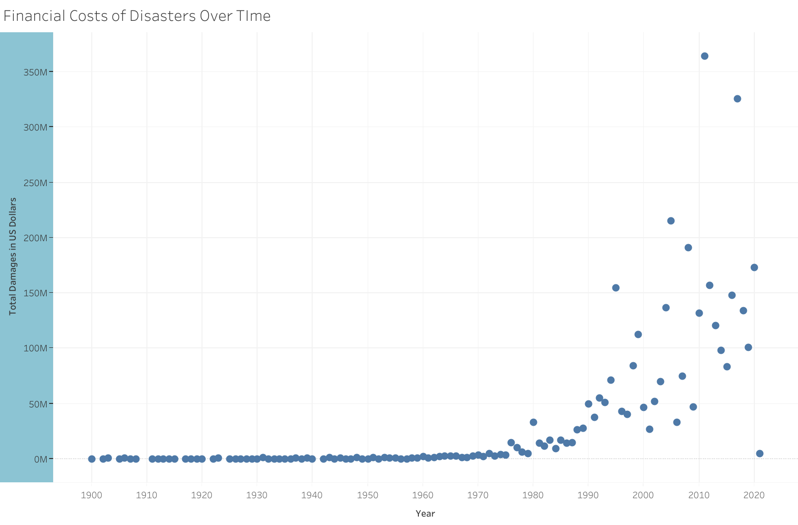
The financial cost of disasters has increased over time. The chart below shows the change in the cost of damages from climate disasters over time.
Back to Top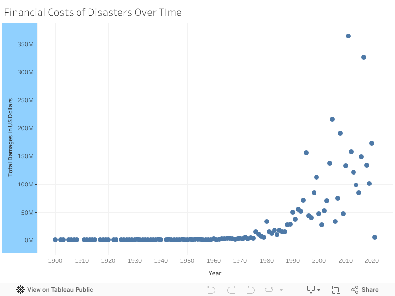
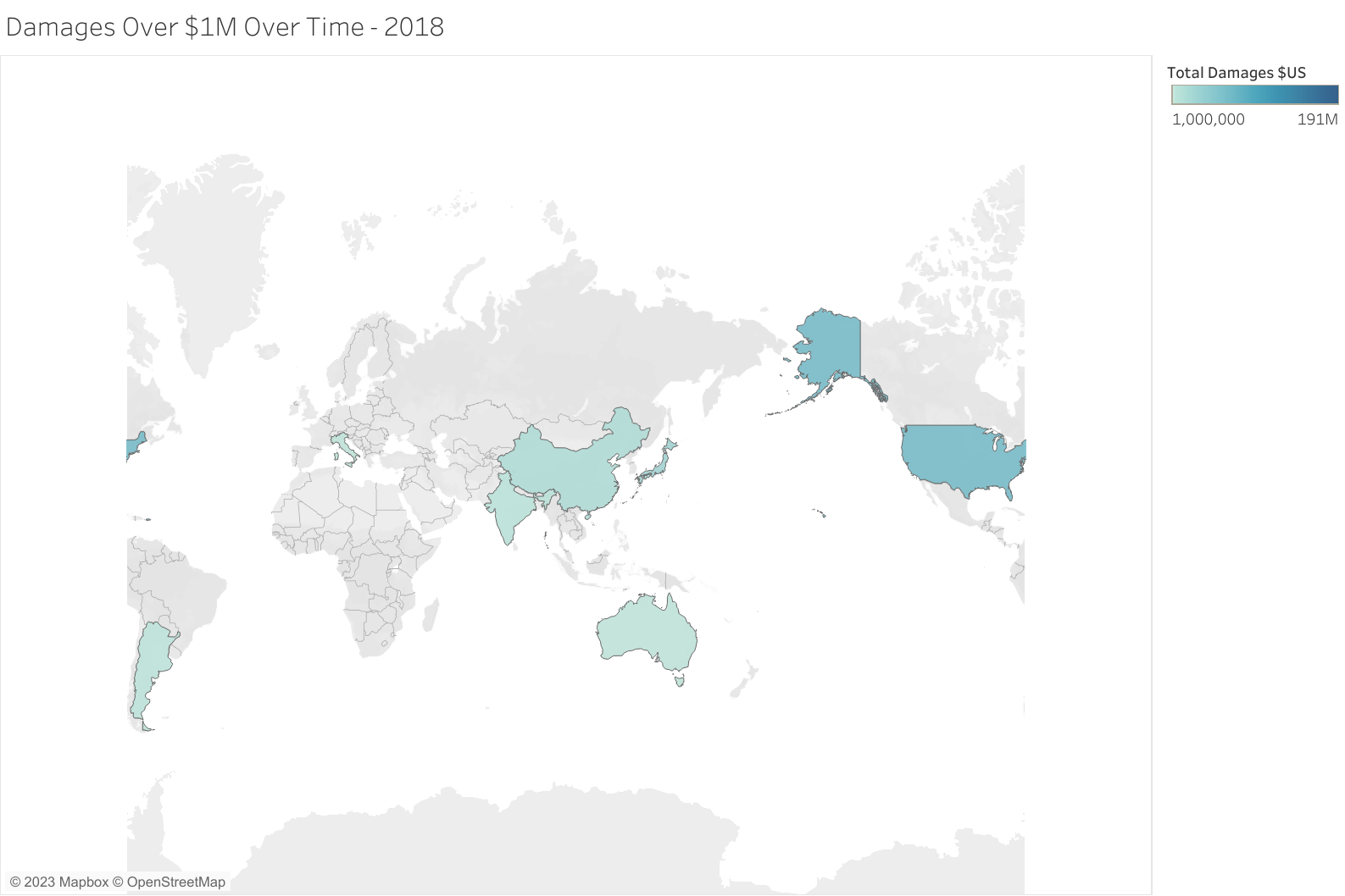
We can also look at the financial costs of climate disasters from a geographical perspective. The chart below shows the total cost of disasters costing over US$1M by country and year. The chart is animated and can automatically show the changes over time. Press the "play" button to animate the chart.
Back to Top
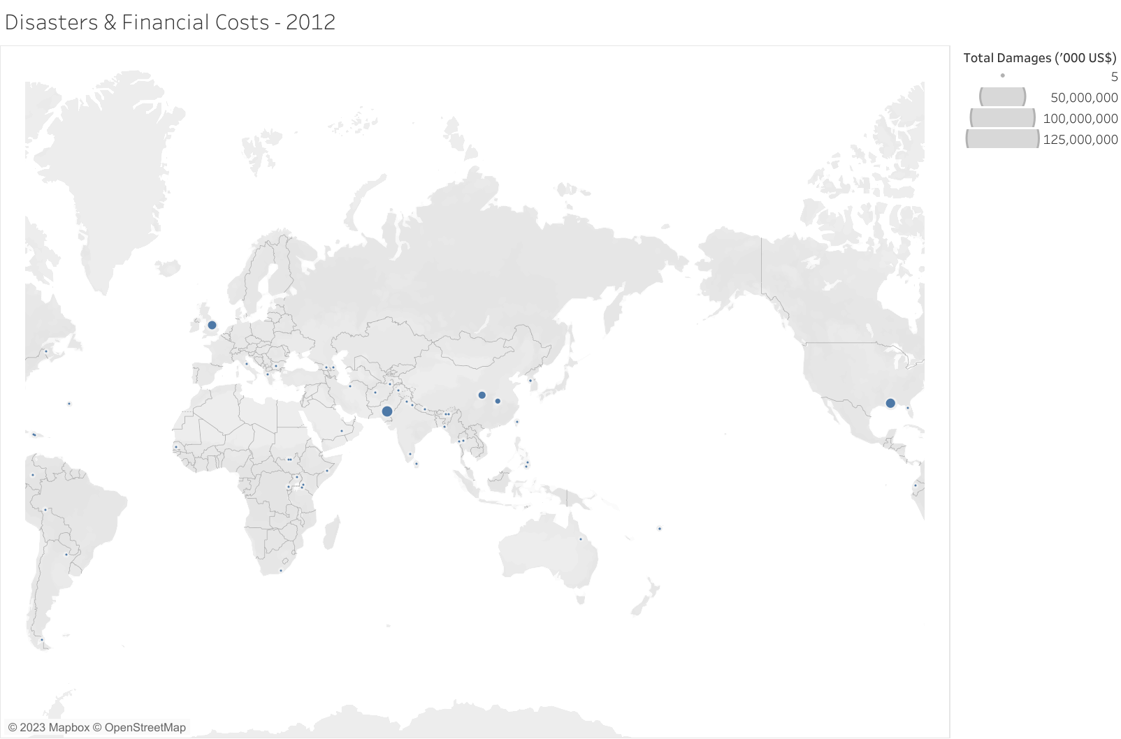
We could also plot the occurrences of disasters over time, where the size of the disaster is the cost of the disaster. The chart is animated and can automatically show the changes over time. Press the "play" button to animate the chart. This chart is not as revealing as the other charts, but we have included it anyway.
Back to Top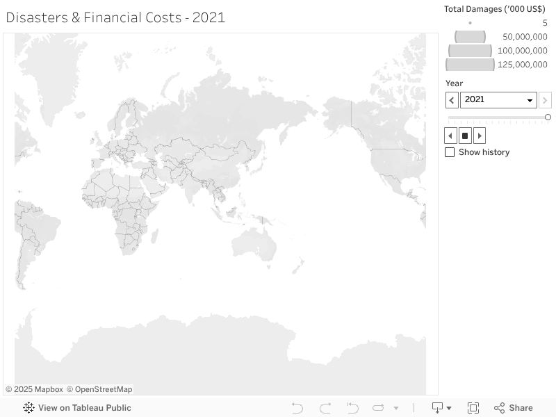
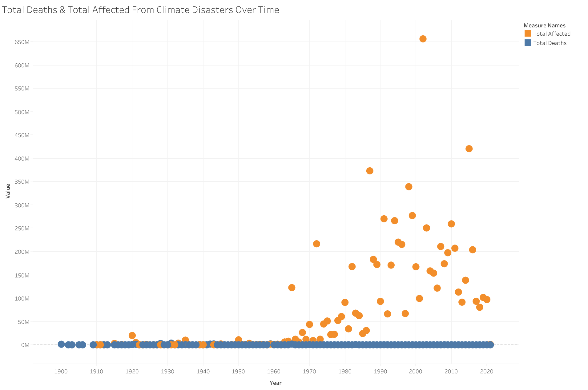
The chart below shows both the number of people affected (orange) by climate disasters and the number of total deaths (blue) per year. You can clearly see an increase in the number of people affected. The number of total deaths appears constant, but in fact, according to our analysis has decreased (the scale of the axis obscures this).
Back to Top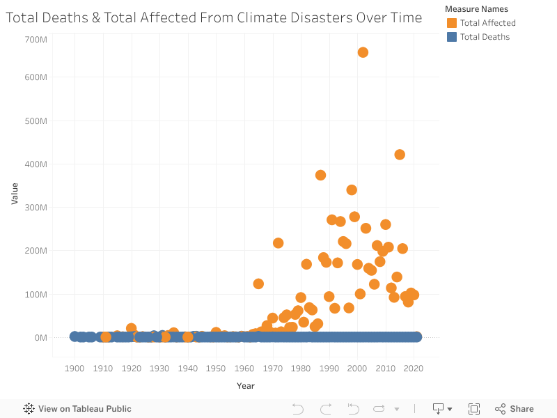
As disasters and storms become more frequent and more intense, they will continue to wreak havoc on communities, especially communities located on coasts and in flood plains. We have already seen in the data an increase in the frequency, damage, and casualties of disasters. As the climate warms further, we should expect to see further increases in these measures. This data and these visualizations help quantify the harm of climate change. This gives us a good indication of the costs we should be willing to incur to prevent damage and casualties. Prevention, mitigation, adaptation, and preparedness are crucial to limiting financial costs and human suffering.
Back to Top